CSS Frameworks for Beginners: Bootstrap and Tailwind for Responsive Web Design in 2026 (Updated June 2026)
CSS frameworks are pre-written collections of CSS classes that let you design professional web pages far faster than writing styles from scratch. Instead of spending four hours figuring out how to make a navigation bar responsive on mobile, you apply two Bootstrap classes and it works. NASSCOM and Deloitte project 1.25 million new digital-skills roles in India by 2027, and responsive web design is listed as a required skill in the majority of those frontend and full stack job descriptions. Bootstrap is the framework that gets you there fastest as a beginner — and this guide explains how it works, how it compares to Tailwind CSS, and which one you should learn first depending on your goals.

- CSS frameworks provide ready-made styles and components so you do not need to write CSS from scratch
- Bootstrap is the most beginner-friendly: apply class names in HTML, get a responsive layout instantly
- Tailwind CSS uses utility classes and offers more design flexibility but has a steeper learning curve
- Both frameworks follow mobile-first design principles — layouts work on phones before scaling to desktop
- Frontend developers with Bootstrap or Tailwind skills earn Rs 3.5 to Rs 7 LPA in Maharashtra (PayScale 2025)
What Is a CSS Framework and Why Do Professional Developers Use Them?
When you write CSS from scratch for a website, you are solving problems that thousands of developers before you have already solved. How do you make a button look consistent across browsers? How do you create a navigation bar that collapses into a hamburger menu on mobile? How do you build a card layout that stays in three columns on desktop and switches to one column on a phone? CSS frameworks package the answers to these questions into reusable class names. You add the class to your HTML element, and the framework handles the styling. This speeds up development significantly — experienced developers estimate that using Bootstrap cuts frontend development time by 40 to 60 percent on standard CRUD projects. It also ensures visual consistency, cross-browser compatibility and responsive behaviour by default — three things that are otherwise tedious to test and fix manually.
Bootstrap: The Most Popular CSS Framework Explained for Beginners
Bootstrap is one of the most popular CSS frameworks in the world and the first one most web development students in India learn. It was created by Twitter in 2011 and is now on version 5. Bootstrap works by giving you a large library of pre-defined class names. You add those class names to your HTML elements and Bootstrap applies the corresponding styles. For example, the class btn btn-primary gives you a blue button with proper padding and hover effects. The class navbar navbar-expand-lg gives you a horizontal navigation bar on large screens that collapses to a hamburger icon on small screens. The class card gives you a styled content card with header, body and footer sections. You do not need to write a single line of CSS for any of these — Bootstrap handles it all. This is why it is so fast for beginners: you focus on building structure and functionality, and the visual design comes for free.
| Feature | Bootstrap 5 | Tailwind CSS |
|---|---|---|
| Design approach | Pre-built components | Utility-first classes |
| Learning curve | Low (beginner-friendly) | Moderate |
| Design flexibility | Moderate (Bootstrap look) | High (custom design) |
| Used with React? | Yes (React-Bootstrap) | Yes (very common) |
| Best for | Beginners, IT services projects | Product companies, startups |
How Bootstrap Grid System and Responsive Design Work
The most important concept in Bootstrap is its grid system. Bootstrap divides every row of content into 12 invisible columns. You specify how many of those 12 columns each element should occupy at different screen sizes. A class of col-md-4 means the element takes up 4 of the 12 columns — one-third of the row — on medium screens (tablets and above). On small screens (mobile phones), it automatically collapses to full width unless you specify otherwise. This is what mobile-first design means: you define the mobile layout as the default and then use class suffixes like sm, md, lg and xl to make the layout wider on larger screens. In practice: a three-column card layout uses col-md-4 on each card, and Bootstrap makes it single-column on mobile automatically. Understanding this grid system is the single most useful skill a beginner can take from Bootstrap, because the concept of responsive column grids appears in every other framework, including Tailwind and React component libraries.
Tailwind CSS: Utility-First Design for More Flexible Layouts
Tailwind CSS takes a different philosophy from Bootstrap. Instead of giving you pre-designed components like navbars and cards, Tailwind gives you hundreds of small single-purpose utility classes that you combine to build any design you want. A Bootstrap navbar looks like every other Bootstrap navbar unless you override styles. A Tailwind navbar looks exactly the way you design it, because you are specifying every property — flex flex-row justify-between items-center p-4 bg-blue-800 text-white — individually. The advantage is complete design freedom. The disadvantage is that it takes longer to learn and your HTML becomes more cluttered with class names. Tailwind is preferred by React and Next.js developers who want custom UI without fighting framework defaults. It is also what most startup frontend roles in Bangalore and Pune use in new projects in 2025 and 2026, which is why knowing Tailwind gives you an edge in product-company interviews over Bootstrap alone.
Bootstrap vs Tailwind: Which CSS Framework Should You Learn First?
Here is the practical answer for a beginner: learn Bootstrap first, then Tailwind. Bootstrap gives you immediate results, teaches responsive grid thinking and gets your portfolio projects looking professional within your first week. Once you understand how frameworks work conceptually — class-based styling, responsive breakpoints, component libraries — switching to Tailwind is much faster than starting with Tailwind from scratch. The other factor is your job target. If you want to work at an IT services company like Infosys, Wipro or TCS on client projects, Bootstrap knowledge is almost always sufficient and commonly required. If you want a product company or startup role, Tailwind plus React is increasingly the expected combination. ABC Trainings teaches Bootstrap in the early modules of the Full Stack MERN course and introduces Tailwind after React, which aligns with how most Indian development teams adopt these tools in practice.
Career Prospects for Web Developers Who Know CSS Frameworks in India
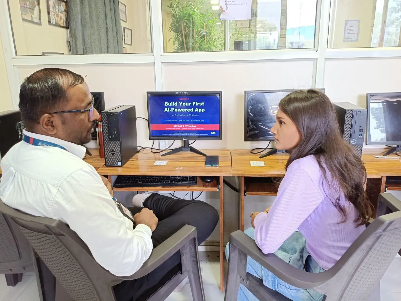
Frontend developers who know CSS frameworks are actively hiring targets across India. PayScale data for 2025 shows that a junior frontend developer with Bootstrap skills in Maharashtra earns Rs 3.5 to Rs 5.5 LPA at IT services companies. A mid-level frontend developer with React and Tailwind CSS earns Rs 6 to Rs 10 LPA at product companies and startups. Companies actively hiring in Pune include Infosys, KPIT Technologies, Tata Technologies, Persistent Systems and several hundred funded startups in Hinjewadi and Magarpatta. In Sambhajinagar, IT-manufacturing companies like Skoda VW at Shendra and Bajaj at Waluj are adding IT support functions that need web-capable developers for internal tooling. ABC Trainings Full Stack MERN course at Wagholi, Hadapsar, Cidco and Osmanpura covers Bootstrap and Tailwind as part of the web design module. Evening batches available. Call 7039169629 or WhatsApp 7774002496 for the current batch schedule.
Get the Web Development Training Brochure + Fees + Batch Dates on WhatsApp
Free 1:1 counselling. Placement track record. CMYKPY/PMKVY eligibility check.
💬 Get Brochure on WhatsApp📞 Call 7039169629About the author: Amit Kulkarni. 8 yrs leading IT training at ABC Trainings, ex-Infosys.
Visit Our Centers
- Wagholi (Pune): 1st Floor, Laxmi Datta Arcade, Pune-Ahilyanagar Highway. Call 7039169629
- Hadapsar (Pune HQ): 1st Floor, Shree Tower, opp. Vaibhav Theater, Magarpatta. Call 7039169629
- Cidco (Chh. Sambhajinagar): Kalpana Plaza, opp. Eiffel Tower, N-1 Cidco. Call 7039169629
- Osmanpura (Chh. Sambhajinagar): S.S.C Board to Peer Bazar Road, near Jama Masjid. Call 7039169629
- Sangli: Shubham Emphoria, 1st Floor, Above US Polo Assn., Sangli-Miraj Rd, Vishrambag. Weekend batches available. Call 7039169629
FAQs
Do I need to know CSS before learning a CSS framework like Bootstrap?
Yes — you need a basic understanding of CSS properties like color, margin, padding, font-size and display before a framework makes sense. You do not need to master CSS, but knowing what each property does helps you understand why Bootstrap classes work the way they do. At ABC Trainings, CSS fundamentals are covered in weeks one and two before Bootstrap is introduced.
Is Bootstrap still relevant in 2026 or has Tailwind replaced it?
Bootstrap is still widely used in 2026, especially at IT services companies and for rapid prototyping. Tailwind has grown significantly in product companies and startups. The honest answer is both are relevant, with Tailwind gaining ground in new projects. Learning Bootstrap first and then Tailwind is the practical path for most developers.
Can I use Bootstrap with React or Next.js?
Yes. React-Bootstrap is a library that wraps Bootstrap components as React components, so you can use them with props and JSX. Tailwind CSS works natively with React and is the preferred choice for most new React projects in 2025 and 2026.
Where can I learn Bootstrap and Tailwind CSS in Pune or Aurangabad?
ABC Trainings covers Bootstrap and Tailwind CSS as part of the Full Stack MERN Development course at its Wagholi and Hadapsar centres in Pune and Cidco and Osmanpura centres in Sambhajinagar. Evening batches are available for working professionals. Call 7039169629 or WhatsApp 7774002496 for fees and batch dates.