Data Analytics Capstone Project 11: Build a Sales Performance Dashboard from Scratch (Updated May 2026) (Updated May 2026)
TCS laid off approximately 12,000 employees in the first half of 2025, and the message was clear — generic IT profiles are the most exposed. What's insulated from that wave? Analysts who can turn messy sales data into a decision-ready dashboard in 30 minutes. Capstone Project 11 in the ABC Trainings Data Analytics programme is exactly that exercise: a real-world sales dataset with multiple regions, products and salesperson records, and the task of building a complete performance dashboard from scratch. The objective the company gave us is direct — how much is being sold, which region is performing best, which products are underperforming, and which salesperson is costing revenue? In this walkthrough you'll clean the raw data, build the data model, design KPI cards, create regional and product drill-down views, and produce an executive summary page that any business head can read in 30 seconds. The video linked above shows the full live build; this article adds the analytical reasoning — why each design decision matters for the story the dashboard tells.

- Capstone Project 11 builds a complete sales performance dashboard from raw multi-region sales data
- Covers data cleaning, KPI card design, regional drill-down, product analysis and executive summary
- TCS 12,000 layoffs (Jul 2025) hit generic IT profiles hardest — analysts with dashboard skills are insulated
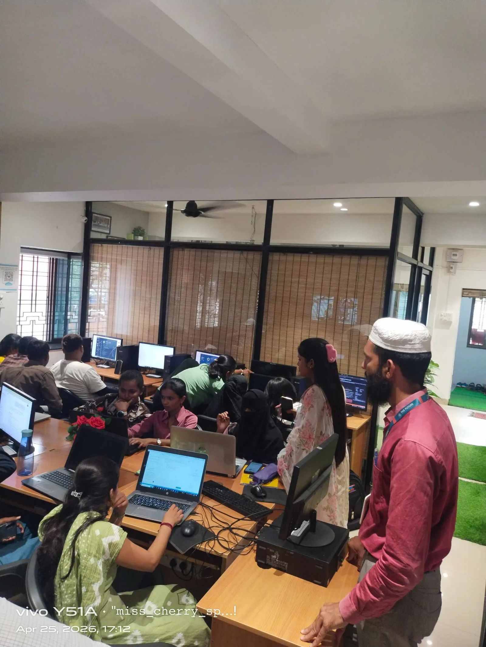
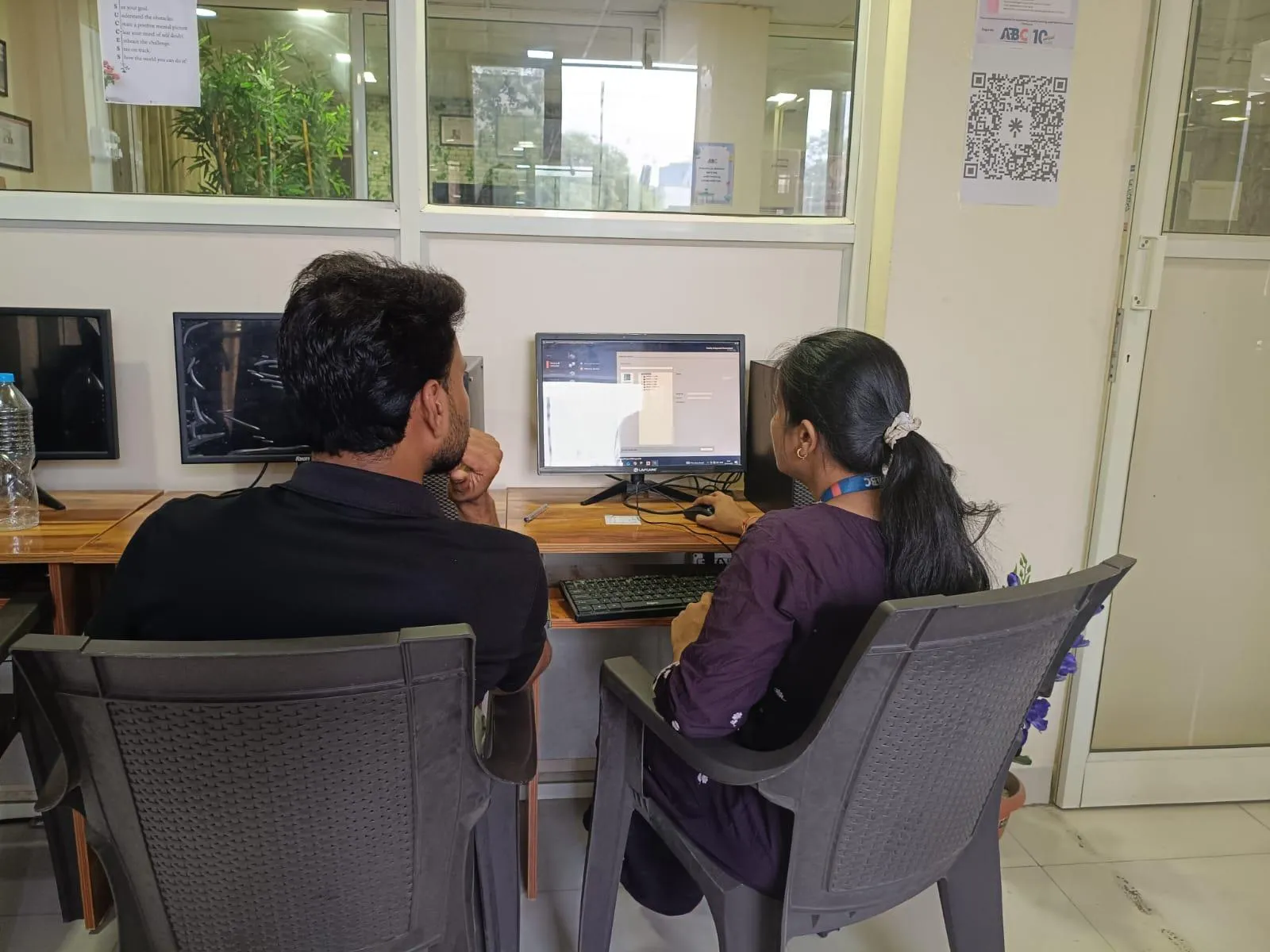
- ABC Trainings data analytics programme includes 12+ capstone projects across Excel, Power BI and Python
- CMYKPY: ₹6,000–₹10,000/month stipend for eligible Maharashtra students during data analytics training
Project 11 Overview: What the Company Wants to Know
The dataset for Project 11 comes from four sources: sales transaction data (order ID, date, product, region, value, salesperson), product master (category, unit price, cost), customer master (segment, city, account size), and salesperson data (team, territory, target). Before building a single chart, you need to answer the company's core questions: How much total revenue did we generate this period? Which region overperformed against target? Which products have falling margins? Which salesperson is consistently below quota? These questions drive every design decision in the dashboard — the charts, filters, KPIs and layout all serve these four questions and nothing else. This discipline of question-first design is what separates a junior analyst from a senior one, and it's what Infosys, TCS, Mahindra Finance and Bajaj Finserv look for in data analyst interviews.

Step 1 — Data Cleaning and Source Integration
Raw sales data almost always arrives dirty: duplicate order IDs, inconsistent product names (LAPTOP vs Laptop vs laptop), missing region codes, and dates formatted as text. In Excel, use Power Query (Get & Transform) to load all four source tables. Apply the following cleaning steps: remove duplicates using the Remove Duplicates step in Query Editor; standardise text columns with Text.Proper or Text.Upper transformations; fill null region codes using a merge with the customer master on Account ID; convert date-text columns to Date type explicitly. In Power BI, import from the same Excel source or connect directly to the CSV files and apply the same transformations in Power Query Editor. The critical habit: never clean data by overwriting source cells — always use a transformation step you can audit and replay.
| Dashboard Section | Tool | Key Output | Skill Demonstrated |
|---|---|---|---|
| Data Cleaning | Power Query | Clean, merged fact table | ETL and data preparation |
| Data Model | Power BI Model View | Star schema with DAX measures | Data modelling, DAX |
| Regional Analysis | Power BI Visuals | Revenue vs Target by region | Comparative analysis |
| Product Analysis | Power BI Scatter + Matrix | Revenue-Margin quadrant | Profitability analysis |
| Salesperson Analysis | Ranked Bar + Tooltip Page | Attainment % ranking | Performance reporting |
| Executive Summary | Power BI Layout Design | One-page decision brief | Data storytelling |
Step 2 — Building the Data Model and KPI Logic
The data model is a star schema: the Sales fact table in the centre, with dimension tables for Product, Customer, Salesperson and Date radiating out. Create relationships in Power BI Model view: Sales[ProductID] to Product[ProductID], Sales[CustomerID] to Customer[CustomerID], Sales[SalespersonID] to Salesperson[SalespersonID], Sales[OrderDate] to DateTable[Date]. The Date table is critical — create it explicitly using CALENDAR(MIN(Sales[OrderDate]), MAX(Sales[OrderDate])) in a calculated table, not by relying on auto date/time. KPI logic: Total Revenue = SUM(Sales[OrderValue]); Revenue vs Target = DIVIDE([Total Revenue], SUM(Salesperson[Target])); Gross Margin % = DIVIDE(SUM(Sales[OrderValue]) - SUM(Sales[COGS]), SUM(Sales[OrderValue])). Define these as explicit DAX measures, not implicit calculated columns — measures recalculate per filter context, which is what enables drill-down.

Step 3 — Regional and Product Performance Views
The regional performance page uses a filled map or bar chart filtered by Region slicer. Add a small multiples bar chart showing Revenue vs Target per region side-by-side — this makes over- and under-performance immediately visible without a table. For product analysis, a scatter plot of Revenue vs Margin % per product category reveals the dangerous quadrant: high revenue but low margin products that look successful until you see the cost structure. Flag those in a conditional-format matrix: red for below-target margin, green for above. For salesperson analysis, a ranked bar chart sorted by Revenue Attainment % (actual/target) shows who's driving performance and who needs coaching. Add a tooltip page showing the salesperson's top 5 accounts by value when the user hovers over a bar — recruiters at Mahindra Finance, Bajaj Finserv and HDFC Bank love this interaction in analyst portfolio reviews.
Step 4 — The Executive Summary Page and Storytelling
The executive summary page has one job: tell the story in under 30 seconds for someone who won't click a slicer. Design it with four KPI cards across the top (Total Revenue, Revenue vs Target %, Top Region, Gross Margin %), a single trend line showing monthly revenue vs target, and a three-bullet text box with the key findings written in plain language: which region led, which product dragged, which salesperson was the standout. Use a neutral white background with dark-grey text and blue accent colours — no dark backgrounds, no neon, no decorative gradients. Recruiters at Infosys Analytics, TCS iON, Wipro data practices and mid-sized analytics firms consistently respond better to clean, readable dashboards than to visually elaborate but confusing ones. Your executive summary page is the screenshot that goes in your portfolio PDF — make it the most polished page in the file.
Maharashtra's CMYKPY scheme provides ₹6,000–₹10,000/month to eligible students during certified data analytics training. ABC Trainings is an approved NSDC/NASSCOM training partner. Call +91 7039169629 or WhatsApp 7774002496 to check eligibility before your next batch start date.Get the Data Science Brochure + Fees + Batch Dates on WhatsApp
Free 1:1 counselling. Placement track record. CMYKPY/PMKVY eligibility check.
💬 Get Brochure on WhatsApp📞 Call 7039169629About the author: Rahul Patil. 12 yrs experience training engineers across Maharashtra.
Visit Our Centers
- Wagholi (Pune): 1st Floor, Laxmi Datta Arcade, Pune-Ahilyanagar Highway. Call 7039169629
- Hadapsar (Pune HQ): 1st Floor, Shree Tower, opp. Vaibhav Theater, Magarpatta. Call 7039169629
- Cidco (Chh. Sambhajinagar): Kalpana Plaza, opp. Eiffel Tower, N-1 Cidco. Call 7039169629
- Osmanpura (Chh. Sambhajinagar): S.S.C Board to Peer Bazar Road, near Jama Masjid. Call 7039169629
- Sangli: Shubham Emphoria, 1st Floor, Above US Polo Assn., Sangli-Miraj Rd, Vishrambag. Weekend batches available. Call 7039169629
FAQs
What is Capstone Project 11 in the ABC Trainings data analytics course?
Capstone Project 11 is a guided build of a complete sales performance dashboard using real-world multi-region sales data. You clean four data sources, build a star-schema data model, create KPI cards, regional and product performance views, and an executive summary page. The objective is to answer four business questions: total revenue, best region, underperforming products, and salesperson attainment vs target.
What tools are used to build the sales performance dashboard?
Project 11 uses Microsoft Excel (Power Query for data cleaning and initial modelling) and Power BI Desktop (data model, DAX measures, visuals and report layout). The same workflow is reproducible in Google Looker Studio or Tableau with minor adjustments — the analytical thinking and data modelling concepts transfer directly.
What jobs does a data analytics capstone portfolio open in Maharashtra?
A portfolio of 10–12 completed capstone projects demonstrating real-world analysis skills opens junior data analyst roles (₹3–4.5 LPA), MIS executive positions, and business intelligence analyst roles at firms like Infosys, TCS, Mahindra Finance, Bajaj Finserv and mid-sized analytics companies across Pune, Mumbai and Bengaluru.
How long does the ABC Trainings data analytics programme take?
The ABC Trainings data analytics programme runs for 3–4 months and includes Excel, SQL, Power BI, Python basics and 12+ capstone projects. New batches start every month at Pune Wagholi, Hadapsar, Cidco Sambhajinagar and Osmanpura. Call +91 7039169629 to check the next start date.