HTML Responsive Design, Forms and Tables — Complete Web Design Guide (Updated May 2026)
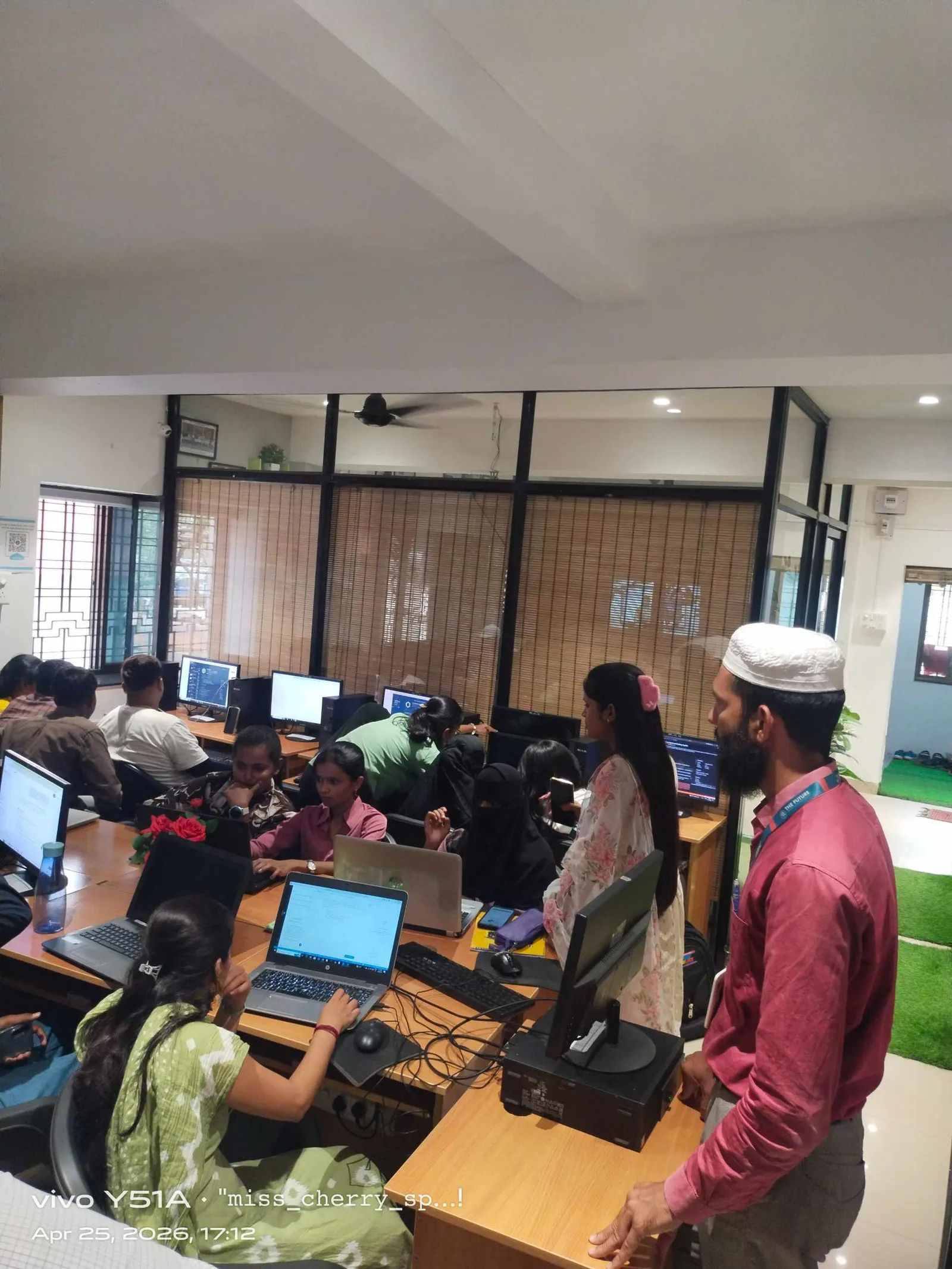
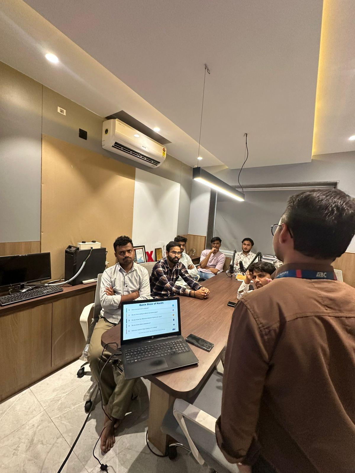
When NASSCOM and Deloitte jointly projected that India needs 1.25 million AI and digital professionals by 2027, web development sat right at the foundation of that demand. Every mobile app, every SaaS dashboard, and every e-commerce platform you use starts with HTML — and the three topics that trip up most beginners — responsive layouts, forms, and tables — are exactly what interviewers at Infosys, TCS, and Persistent Systems test on day one. Here's the complete guide from ABC Trainings, where we've trained 20,000+ students in Pune, Sambhajinagar, and Sangli.

- NASSCOM-Deloitte: India needs 1.25 million digital professionals by 2027 — HTML skills are the entry requirement
- HTML responsive design uses the viewport meta tag, percentage widths, media queries, and CSS flexbox/grid
- HTML forms collect user input with input types, label-for associations, required/pattern validation, and ARIA
- HTML tables use thead/tbody/tfoot, scope attributes, and overflow-x wrappers for mobile responsiveness
- Responsive design + forms are routinely tested in fresher interviews at Infosys, TCS, and Persistent Systems
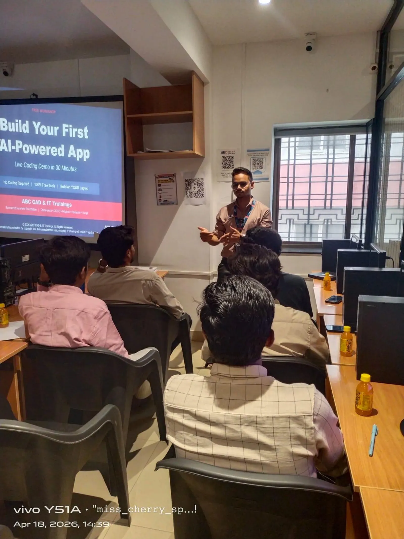
- ABC Trainings covers all three topics in the AI Powered Application Development workshop at Pune and Sambhajinagar
What Is HTML Responsive Design and Why Does It Matter in 2026?
Responsive design means your webpage automatically reconfigures its layout, typography, and media to fit whatever screen renders it — whether a Rs.7,000 Android phone at 4.5 inches or a 27-inch desktop monitor. Before responsive CSS, developers maintained separate desktop and mobile codebases — double the work, double the bugs. Today, Google uses mobile-first indexing, meaning its crawler evaluates the mobile version of your page first when deciding search rankings. If your layout breaks at 375px, your pages lose ranking points. The starting point for every responsive page is the viewport meta tag: width=device-width, initial-scale=1. Without it, mobile browsers scale the page down to fit — making text illegibly small. From there, you use relative units (%, vw, rem, em) instead of fixed pixel widths, and CSS breakpoints to switch layouts at defined viewport thresholds. These three fundamentals — viewport meta tag, relative units, breakpoints — are what ABC Trainings teaches in session one of the web design module.
CSS Media Queries, Flexbox and Grid: The Three-Tool Responsive Toolkit
Media queries are CSS conditional blocks that apply rules only when specific conditions are met — most commonly when the screen width crosses a breakpoint. The standard breakpoints in 2026 are 480px (mobile), 768px (tablet), and 1024px+ (desktop). Inside a media query, you can change any CSS property — column counts, font sizes, visibility. But media queries alone are not enough. CSS Flexbox is a one-dimensional layout model perfect for navbars, card rows, and form layouts — it distributes space among items in a single row or column. CSS Grid is the two-dimensional model for full-page templates — it handles rows and columns simultaneously. Trust me, the first time you watch a three-column card grid collapse into a single-column mobile stack with just one media query, the responsive design mental model clicks permanently. Together, media queries, flexbox, and grid handle 95% of responsive layout needs without any framework or library.
| Tool | Best For | Dimension | Common Use Case |
|---|---|---|---|
| Media Queries | Switching layouts at breakpoints | N/A | 3-col to 1-col at 768px |
| CSS Flexbox | One-dimensional layouts | Row or column | Navbar, card row, form layout |
| CSS Grid | Two-dimensional layouts | Rows and columns | Page templates, dashboards |
| Viewport Meta Tag | Enable mobile scaling | N/A | Required on every responsive page |
| Relative Units (%, rem, vw) | Fluid sizing | Length | Font size, padding, container widths |
HTML Forms: Labels, Input Types, Validation and Accessibility
HTML forms are how websites capture user data: registrations, contact submissions, bookings, search queries. The semantic elements are form, input, label, select, textarea, button, and fieldset. The most commonly missed detail in beginner code is the label-for pattern: a label element with a for attribute matching the id of its input. This connection is critical for screen readers, tested in accessibility audits, and asked in interviews. HTML5 brought built-in validation: required prevents empty submission, type=email validates format, minlength and maxlength control length, and pattern allows regex rules. For responsive forms on mobile, three CSS rules handle most needs: width:100% on inputs, display:block on labels (forces label-above-input stacking), and a minimum height of 44px on touch targets — Google's mobile UX guideline. Companies like TCS and Infosys ask form-specific questions in fresher interviews, and poor label-for usage is a common rejection point.
HTML Tables: Semantic Markup, Scope Attributes and Mobile Fixes
HTML tables are for tabular data — salary comparisons, course schedules, product specs. The semantic structure is: table > caption (title) > thead > tr > th with scope=col > tbody > tr > td. The scope attribute — either col or row — tells screen readers how to interpret the header-data relationship. This is a W3C accessibility requirement checked in web audits. Tables break on mobile because their natural horizontal extent overflows narrow screens. The standard fix is wrapping the table in a div with overflow-x:auto. For data-heavy tables, an alternative is converting to a card layout at the mobile breakpoint — each row becomes a card showing label:value pairs. The good news is that Google reads table content for Featured Snippets, so a well-marked-up salary or comparison table can earn your page a position-zero placement for high-value queries.
How Responsive Forms and Tables Work Together in Real Projects
In real projects, responsive forms and tables appear together constantly. An admin panel for a coaching institute has a filter form at the top and a student data table below. A course comparison tool has inputs for budget and duration, and a results table. A practical example from ABC Trainings' own curriculum: an HTML form with select dropdowns for course name and city, a date range input pair, and a submit button — followed by a responsive table with columns: Student Name, Contact, Course, Enrollment Date, Status. On mobile, the filter form stacks vertically and the table gets a horizontal scroll wrapper. Students build this in a single class session at ABC Trainings. It integrates all three responsive skills and mirrors the CRUD interface asked in front-end technical interviews.
Web Design Jobs in Pune and Maharashtra: 2026 Salary Data
Web design and front-end development jobs in Maharashtra pay well for trained candidates. Entry-level front-end roles in Pune earn Rs.2.5–4.5 LPA (PayScale India, 2025). Junior web developers with 1–2 years of experience reach Rs.5–8 LPA. Senior front-end developers and React specialists at Pune product companies earn Rs.10–18 LPA. Key Pune employers hiring web developers include: Infosys BPM (IT Park Road, Hinjewadi Phase 1), TCS (Ramwadi, Kharadi), Persistent Systems (Senapati Bapat Marg), KPIT Technologies (Plot A-7, Rajiv Gandhi Infotech Park, Hinjewadi), and Cybage Software (Viman Nagar). In Sambhajinagar, the tech-enabled BPO sector and IT services firms near CIDCO hire trained HTML/CSS developers at Rs.1.8–3 LPA. Maharashtra's CMYKPY scheme offers Rs.6,000–10,000/month stipend while you train. PMKVY 4.0 has certified 2.1 crore students nationally — web design courses are among the most enrolled tracks.
Learn HTML and CSS at ABC Trainings: Batches, Centers and Fees
ABC Trainings teaches HTML, CSS responsive design, forms, and tables as part of the AI Powered Application Development workshop. The course uses project-based learning: you build a responsive landing page, a student registration form with validation, and an admin data table during training. Batches run on weekdays and weekends. Centers are at Wagholi (Laxmi Datta Arcade, Pune-Ahilyanagar Highway), Hadapsar (Shree Tower, opp. Vaibhav Theater), Cidco Sambhajinagar (Kalpana Plaza, opp. Eiffel Tower), Osmanpura Sambhajinagar (near Jama Masjid, SSC Board Rd), and Sangli (Shubham Emphoria, Sangli-Miraj Rd, Vishrambag). Our trainers are working IT professionals — ex-Infosys and ex-TCS — with real project experience. Affiliated with NSDC, Skill India, and NASSCOM. Call +91 7039169629 or WhatsApp 7774002496 to check batch dates and CMYKPY eligibility.
Get the Web Design Brochure + Fees + Batch Dates on WhatsApp
Free 1:1 counselling. Placement track record. CMYKPY/PMKVY eligibility check.
💬 Get Brochure on WhatsApp📞 Call 7039169629About the author: Amit Kulkarni. 8 yrs leading IT training at ABC Trainings, ex-Infosys.
Visit Our Centers
- Wagholi (Pune): 1st Floor, Laxmi Datta Arcade, Pune-Ahilyanagar Highway. Call 7039169629
- Hadapsar (Pune HQ): 1st Floor, Shree Tower, opp. Vaibhav Theater, Magarpatta. Call 7039169629
- Cidco (Chh. Sambhajinagar): Kalpana Plaza, opp. Eiffel Tower, N-1 Cidco. Call 7039169629
- Osmanpura (Chh. Sambhajinagar): S.S.C Board to Peer Bazar Road, near Jama Masjid. Call 7039169629
- Sangli: Shubham Emphoria, 1st Floor, Above US Polo Assn., Sangli-Miraj Rd, Vishrambag. Weekend batches available. Call 7039169629
FAQs
What is the difference between HTML tables and CSS Grid for page layout?
HTML tables should only be used for tabular data — salary comparisons, schedules, feature matrices. Never use them for page layout. CSS Grid is the right tool for two-dimensional page layout: defining rows, columns, and areas across the full page. Using tables for layout breaks responsive design, harms screen-reader accessibility, and is flagged as a critical error by Google Lighthouse. Always choose Grid or Flexbox for layout and tables only for actual structured data.
Do I need JavaScript to create responsive HTML forms?
No — CSS handles most responsive form requirements without JavaScript. The viewport meta tag, percentage-width inputs, and media queries give you fully responsive form layouts. HTML5 attributes like required, type=email, minlength, and pattern provide built-in validation. JavaScript adds value for complex custom validation, real-time character counts, or async form submission — but the foundational responsive form structure is pure HTML and CSS.
How do CSS media queries affect Google search rankings?
Google uses mobile-first indexing, so pages that render poorly on mobile get lower rankings. Media queries directly improve Core Web Vitals — Cumulative Layout Shift (CLS) and Largest Contentful Paint (LCP) — which are official Google ranking factors since 2021. A mobile-responsive page consistently outranks a fixed-width equivalent for the same keyword, assuming comparable content quality.
Can a complete beginner learn HTML responsive design at ABC Trainings?
Yes, absolutely. ABC Trainings' AI Powered Application Development workshop starts from scratch — no prior coding experience needed. The HTML and CSS modules cover the viewport meta tag, media queries, flexbox, grid, forms with validation, and semantic table markup — all through real project examples. Batches run on weekdays and weekends at Wagholi, Hadapsar, Cidco, Osmanpura, and Sangli. Call +91 7039169629 or WhatsApp 7774002496 to enroll.