CSS3 Display and Float: Complete Guide for Web Developers (Updated June 2026)
If you are learning web development in 2026, CSS3 display and float are two concepts you will use on your very first real project — and keep using for the rest of your career. Here is the thing most tutorials miss: understanding when to use display:block, display:inline-block, or float is not just about making things look right; it is about writing CSS that other developers can read, maintain, and build on. NASSCOM-Deloitte projects demand for 1.25 million AI-ready tech professionals in India by 2027, and front-end and full stack developers are a significant chunk of that gap. Employers at Infosys, TCS, Wipro, and every startup hiring in Pune will test your CSS layout knowledge in interviews. This guide covers both properties from first principles, shows you real patterns used in production projects, and connects CSS3 mastery to the full stack developer career path.
- display:block makes elements take full width and stack vertically — used for div, section, h1-h6 by default
- display:inline keeps elements on the same line with no width/height control — used for span, a, strong
- display:inline-block gives the best of both: stays inline but accepts width, height, padding, and margin
- float:left and float:right pull elements out of the normal flow — used for image-text wrapping and legacy layouts
- clearfix is required after floated elements to restore normal document flow
- Full stack developers in Pune and Nagpur earn Rs 5-12 LPA — CSS3 is tested in every front-end interview
Understanding the CSS3 Display Property: Block, Inline, and Inline-Block
The CSS3 display property controls how an HTML element appears and behaves in the document flow. Every HTML element has a default display value — block elements like div, p, h1, section, and article take up the full available width and force subsequent elements onto a new line. Inline elements like span, a, strong, and em take only the width their content requires and sit on the same line as other inline elements — but they do not accept width, height, top/bottom margin, or top/bottom padding in the traditional sense. Inline-block is the most powerful of the three: elements display on the same line as their neighbours but accept width, height, and all padding and margin values. This makes inline-block ideal for navigation menu items, button groups, and image galleries where you want horizontal layout control without using float or flexbox. Understanding display is foundational — flex and grid, the modern layout tools, are extensions of the display property. You set display:flex or display:grid on a container and control its children from there. But float and inline-block still appear in legacy codebases and email templates, so knowing them is not optional.
CSS3 Float Property: How It Controls Element Flow on the Page
The CSS3 float property was originally designed to allow text to wrap around images — think newspaper-style layouts where a photo sits to the left and paragraph text flows around its right side. Float takes an element out of the normal document flow: when you set float:left on an image inside a paragraph, the paragraph text wraps around it. Float:right does the same but positions the element to the right. This behaviour made float the go-to tool for multi-column layouts in pre-flexbox CSS (roughly 2008 to 2016), and you will still encounter it in older codebases at companies that have not yet refactored their front end. What makes float tricky is that floated elements do not contribute to the height of their parent container — so a div containing only floated children appears to have zero height to the browser. This causes the infamous parent collapse problem that every front-end developer encounters. Understanding float also means understanding why modern CSS moved to flexbox and grid for layout, making you a more informed developer who can work with both old and new code.
| Display Value | Width Behaviour | Accepts Width/Height | Common Use |
|---|---|---|---|
| block | Full available width | Yes | div, p, section, h1-h6 |
| inline | Content width only | No | span, a, strong, em |
| inline-block | Content width, inline flow | Yes | Buttons, nav items, image cards |
| none | Removed from layout | N/A | Hiding modals, mobile menus |
| float:left/right | Out of normal flow | Yes | Image-text wrap, legacy columns |
Clearfix Techniques: Restoring Normal Flow After Float
Clearfix is the solution to parent container collapse caused by floated children. The classic clearfix uses a pseudo-element: apply overflow:hidden to the parent container, which forces it to expand around its floated children. A more explicit approach is the clearfix utility class that adds a pseudo-element after the container using content:'' and display:table or display:block with clear:both. Modern practice uses overflow:auto or the more explicit clear:both on an empty div after the floated elements. In production MERN stack applications, you rarely write new float-based layouts — flexbox and CSS Grid handle multi-column layouts more predictably. But clearfix knowledge signals CSS depth to interviewers who ask you to debug a legacy component. Trust me, this question comes up in real interviews at Pune-based product companies. The good news is that once you understand why parent collapse happens, clearfix becomes obvious, not mysterious.
Display vs Float: When to Use Which in Real Projects
The practical rule is: use display:flex or display:grid for new layout work, use float only for text-image wrapping, and use inline-block when you need simple horizontal alignment without a full flex container. In admin dashboards — common in MERN stack projects — you will use display:flex for the navbar and sidebar, display:grid for the card grid in the main content area, and inline-block for button groups and tags inside table cells. Float is still the right tool when you want text to wrap around a pull-quote or a profile photo in a blog post. In email templates (important for transactional email development), you will use display:inline-block extensively because email clients have inconsistent flexbox support. Learning to choose the right display tool for the right context is what separates a junior developer who pastes Stack Overflow answers from a senior developer who writes maintainable CSS from first principles.
Building Real Layouts with Display and Float: Practical Patterns
Here are two real patterns you will use immediately. Pattern one: horizontal navigation bar using inline-block. Set ul to have list-style:none and padding:0, then set li to display:inline-block with padding:10px 20px. This creates a horizontal nav without floats and without flexbox — simple, predictable, and easy to read. Pattern two: two-column article layout using float. Wrap an image with float:left and margin:0 16px 16px 0, and let the paragraph text flow naturally around it. Apply clearfix to the parent article element to prevent collapse. These two patterns alone cover a significant portion of the CSS layout scenarios in a typical blog, e-commerce, or portfolio site. When you are building the front end of a MERN application, you will use flexbox and grid for the main layout, but inline-block and float appear in smaller component-level styling tasks throughout the project.
Full Stack Web Developer Salaries in India 2026
Full stack web developers in India with one to two years of experience earn Rs 5-8 LPA (Glassdoor India, AmbitionBox, April 2026). With three to five years including React, Node.js, and MongoDB skills, the range moves to Rs 9-16 LPA. Senior full stack engineers at Pune product companies and Infosys, TCS, and Wipro digital units earn Rs 18-30 LPA with five or more years. The specific CSS3 skills tested in interviews include layout properties (display, flex, grid, float), responsive design (media queries, rem vs px), and performance (minimising reflow and repaint triggers). Companies like Bajaj Finserv (Pune), Persistent Systems, KPIT Technologies, and numerous SaaS startups on Hinjewadi hire full stack developers continuously. TCS announced 12,000 job reductions in July 2025 in routine coding roles, reinforcing that developers with strong fundamentals across the full stack — not just AI-generated code skills — are the ones retaining and growing their careers.
How ABC Trainings Teaches CSS3 as Part of Full Stack Development
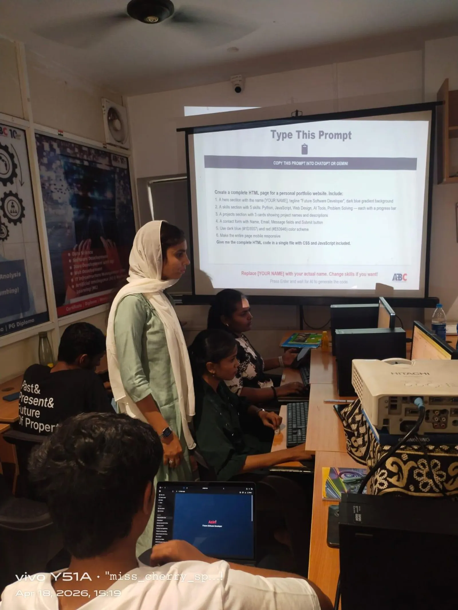
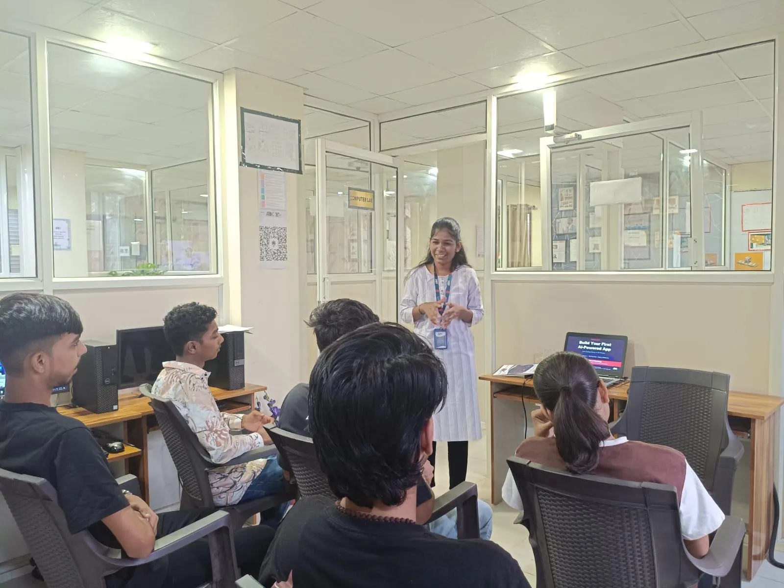
ABC Trainings' AI Powered Application Development course covers HTML5, CSS3, JavaScript, React, Node.js, Express, MongoDB, and deployment on AWS — a complete full stack curriculum taught in Hindi and Marathi so nothing gets lost in translation. CSS3 is covered in dedicated sessions with hands-on projects: building responsive admin dashboards, e-commerce product pages, and portfolio sites that students show in interviews. Instructors like Rahul Patil bring twelve years of training experience and a track record of placing students at Infosys, TCS, Wipro, and Pune-based startups. Weekday and weekend batches run at Wagholi, Hadapsar, Cidco, Osmanpura, and Sangli. CMYKPY stipend eligibility is checked at enrollment — eligible students receive Rs 6,000-10,000 per month while training. Call or WhatsApp 7774002496 for the current batch schedule and fees.
Get the AI Powered Application Development Brochure + Fees + Batch Dates on WhatsApp
Free 1:1 counselling. Placement track record. CMYKPY/PMKVY eligibility check.
💬 Get Brochure on WhatsApp📞 Call 7039169629About the author: Rahul Patil. 12 yrs experience training engineers across Maharashtra.
Visit Our Centers
- Wagholi (Pune): 1st Floor, Laxmi Datta Arcade, Pune-Ahilyanagar Highway. Call 7039169629
- Hadapsar (Pune HQ): 1st Floor, Shree Tower, opp. Vaibhav Theater, Magarpatta. Call 7039169629
- Cidco (Chh. Sambhajinagar): Kalpana Plaza, opp. Eiffel Tower, N-1 Cidco. Call 7039169629
- Osmanpura (Chh. Sambhajinagar): S.S.C Board to Peer Bazar Road, near Jama Masjid. Call 7039169629
- Sangli: Shubham Emphoria, 1st Floor, Above US Polo Assn., Sangli-Miraj Rd, Vishrambag. Weekend batches available. Call 7039169629
FAQs
What is the difference between display:block and display:inline-block in CSS3?
display:block makes an element take up the full available width and start on a new line. It accepts width, height, and all margin and padding values. display:inline-block keeps the element in the same horizontal line as its neighbours (like inline) while still accepting width, height, and top/bottom margin and padding. Use inline-block for horizontal button groups, navigation items, and card layouts where you want horizontal alignment without a flex container.
When should I use float instead of flexbox in CSS?
Use float when you want text to wrap around an image or pull-quote — the original use case float was designed for. For all other multi-column layouts in new code, use flexbox or CSS Grid, which give you predictable, responsive behaviour without the parent collapse problem. Float still appears extensively in legacy codebases and email templates where flexbox support is inconsistent, so knowing it is still a practical skill even if you rarely write new float-based layouts.
What is clearfix and why do I need it after using float?
Clearfix solves the parent container collapse problem: when all children inside a div are floated, the parent div renders with zero height because floated elements are removed from the normal document flow. The fix is to add overflow:hidden to the parent, or use a clearfix utility class that inserts a pseudo-element with clear:both after the floated children. Overflow:hidden is simpler; the clearfix class is more explicit and avoids accidentally clipping content. Both approaches are valid in production code.
How much does a full stack web developer earn in Pune in 2026?
Full stack web developers with one to two years of experience in Pune earn Rs 5-8 LPA (AmbitionBox and Glassdoor India, April 2026). With three to five years and skills in React, Node.js, and MongoDB, the range moves to Rs 9-16 LPA. Companies like Bajaj Finserv, KPIT Technologies, Persistent Systems, and Pune SaaS startups are the consistent hirers. CSS3 layout skills including display, flex, and float are tested in every front-end interview.