CSS3 Table Styling and the Outline Property: Patterns for Admin Dashboards (Updated June 2026)
If you have ever opened a web app and instantly felt that the data table looked messy and unreadable, you understand why CSS3 table styling matters. Plain HTML tables render with zero visual hierarchy — text runs edge to edge, rows bleed into each other, and the whole thing looks like a government form from 2004. In a MERN stack admin dashboard, a data table might be the first screen a business user sees every morning. Making it clean, scannable, and functional is not a design luxury; it is a usability requirement. NASSCOM-Deloitte projects demand for 1.25 million AI-ready tech professionals in India by 2027, and front-end polish is consistently listed as a gap in junior developer candidates. This guide covers every CSS3 table property you need, explains the outline property and its distinct role in accessibility and focus styling, and shows you real patterns from production web applications.
- border-collapse:collapse is the first property you apply to every HTML table — it removes double-border rendering
- Alternating row colours using nth-child(even) improve table readability dramatically in admin dashboards
- The CSS3 outline property adds a visible border outside the border without affecting box model dimensions
- outline is critical for accessibility: removing it on focus without replacement fails WCAG contrast requirements
- Responsive tables on mobile require overflow-x:auto on a wrapper div — not on the table element itself
- Full stack developers in India earn Rs 5-16 LPA — CSS3 table and layout skills are tested in every front-end interview
Why CSS3 Table Styling Matters in Real Web Applications
Tables are everywhere in professional web applications: order management dashboards, employee attendance systems, financial reporting tools, product inventory pages, and exam result portals. The default HTML table renders with no styling — no visible borders, inconsistent spacing, and zero visual hierarchy. CSS3 table styling changes all of this without JavaScript. A well-styled data table reduces the cognitive load on users because they can scan rows and columns quickly, find the data they need, and take action without re-reading the screen. In MERN stack applications, where the backend delivers data via API and React renders it in a table component, the CSS that wraps that component is what users actually experience. Hiring managers at Pune-based product companies regularly ask junior developer candidates to style a table from scratch during technical screenings — it is a quick signal of whether someone understands the CSS box model and layout fundamentals. Getting this right is not glamorous, but it separates polished developers from ones who depend on UI component libraries for everything.
Core CSS3 Table Properties: Border, Padding, and Collapse
The three most important CSS3 table properties are border-collapse, padding, and width. By default, HTML tables render with a gap between cell borders — the HTML table has its own border and each td has its own border, creating a double-border effect. Setting border-collapse:collapse on the table element merges these into single shared borders. This one line of CSS is the difference between an obviously unstyled table and a clean data grid. Padding on th and td elements controls the breathing room inside each cell — typically 8-16px vertically and 12-20px horizontally depending on data density. Table width:100% makes the table fill its container rather than collapsing to content width. For fixed-width columns where text should truncate rather than wrap, add table-layout:fixed to the table and overflow:hidden plus text-overflow:ellipsis to the td. These four properties together — border-collapse, padding, width:100%, and table-layout:fixed — give you the foundation of every professional data table in every production MERN application.
| CSS3 Property | What It Controls | Typical Value |
|---|---|---|
| border-collapse | Merges cell borders into single lines | collapse |
| padding (on th/td) | Cell inner spacing and readability | 10px 16px |
| nth-child(even) | Alternating row background colours | background:#f8fafc |
| outline | Focus ring outside border, no layout shift | 2px solid #1d3557 |
| overflow-x:auto (wrapper) | Horizontal scroll for tables on mobile | On parent div, not table |
Adding Zebra Stripes, Hover Effects, and Header Colours to Tables
Zebra stripes — alternating light and slightly lighter row backgrounds — are the most effective single technique for improving table readability on long datasets. Use tr:nth-child(even) with a light background colour like #f8fafc or #f1f5f9. The header row (thead tr) gets a darker background, typically your brand primary colour, with white or light text. tr:hover with a background transition gives users a visual anchor as they move their cursor across the table. For status columns — active/inactive, pass/fail, pending/complete — use colour-coded span elements inside td cells rather than coloured entire rows, because coloured rows carry too much visual weight and start competing with the zebra stripes. The combination of: header with dark background, zebra body rows, hover highlight, and colour-coded status spans gives you the look of a professional business intelligence tool without any UI component library.
The CSS3 Outline Property: What It Is and When to Use It
The CSS3 outline property renders a line around an element similar to border, but with one crucial difference: outline does not participate in the box model. Adding a border increases an element's occupied space; adding an outline does not. This makes outline ideal for focus states — when a user tabs to a button or link using keyboard navigation, the browser's default focus ring is rendered using outline. This is why you should never write outline:none on a:focus or button:focus without providing an alternative focus indicator. Removing the focus outline without replacement fails WCAG 2.1 AA accessibility standards and breaks keyboard navigation for users with motor disabilities. The correct approach is to replace the default outline with a custom styled version: outline:2px solid your-brand-colour and outline-offset:2px. outline-offset controls the gap between the element edge and the outline ring — a 2-4px offset looks much cleaner than an outline that hugs the element boundary. Outline is also useful for debugging layout: temporarily add outline:1px solid red to any element to see its exact rendered boundaries without changing the layout.
Responsive Tables: Making Data Work on Mobile Screens
Data tables break on mobile because a ten-column table with 100+ characters of data per row simply cannot fit in 375px of viewport width. The correct responsive solution is to wrap the table in a div with overflow-x:auto and a defined max-width. The table itself maintains its natural width, the wrapper shows a horizontal scrollbar on small screens, and users can scroll the table horizontally while the rest of the page stays in place. Do not add overflow-x:auto to the table element itself — this creates inconsistent rendering across browsers. For tables with fewer columns and shorter content, a media query approach can reshape the table on mobile into a stacked card layout: each row becomes a card, each td becomes a labelled value. This requires using data-label attributes on td elements and CSS :before pseudo-elements to display the column headers as inline labels. The overflow-x:auto wrapper is the 80 percent solution; the stacked card approach is for tables where horizontal scrolling would be a poor user experience.
Production Patterns: CSS3 Tables in MERN Stack Admin Dashboards
In a production MERN stack admin dashboard, the typical table component renders data from a REST API endpoint, allows column sorting, row selection, pagination, and inline status updates. The CSS3 table styling sits in a component-level CSS module or Tailwind utility classes. Patterns you will write repeatedly: table with sticky thead for long datasets that scroll vertically, table with row-level action buttons (edit/delete icons) aligned to the right column, table with inline filter inputs in the header row, and table with expandable rows that reveal sub-data on click. Each of these is primarily a CSS problem before it is a JavaScript problem. The stickiness uses position:sticky and top:0 on thead tr. The action column uses text-align:right and white-space:nowrap so buttons do not wrap. The filter inputs use a table-layout:fixed with explicit column widths so filter inputs do not cause columns to shift. These are the real patterns that React developers write in production at companies like Bajaj Finserv Tech, Persistent Systems, and KPIT in Pune.
From CSS3 Fundamentals to Full Stack Developer Career at ABC Trainings
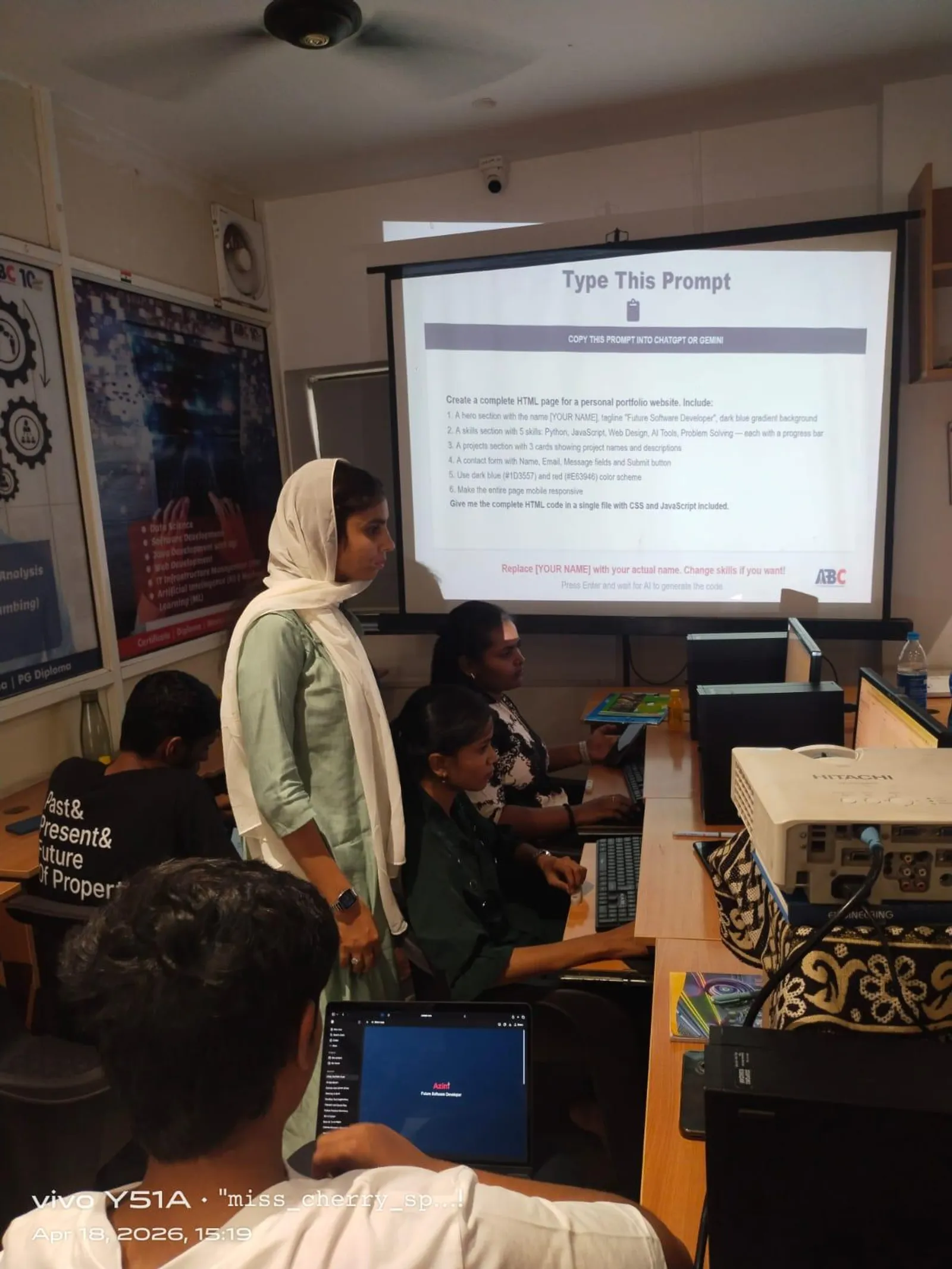
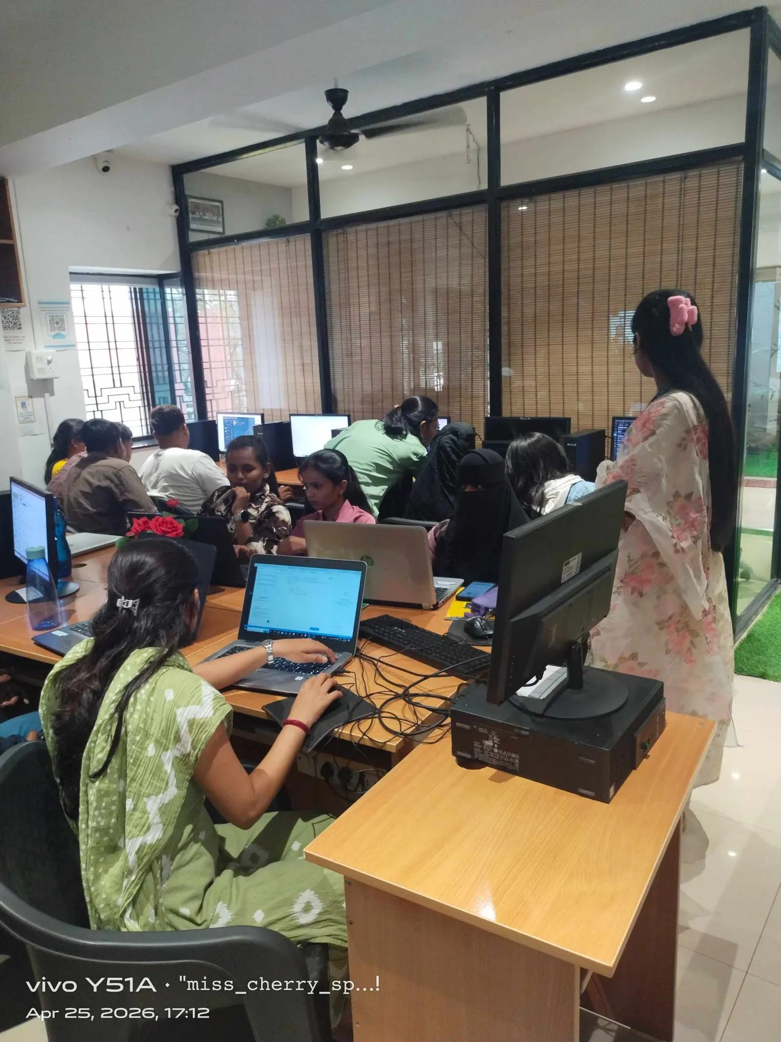
ABC Trainings' AI Powered Application Development course teaches CSS3 as a dedicated module within the full stack curriculum — not as a footnote before jumping to React. Table styling, flexbox, grid, responsive design, and accessibility are all covered with hands-on projects students build from scratch: an admin dashboard, an e-commerce product listing, and a data reporting interface. Our instructors have trained students placed at Infosys, TCS, Wipro, and Pune product companies. Weekday and weekend batches run across all five centres: Wagholi, Hadapsar, Cidco, Osmanpura, and Sangli. The course is delivered in Hindi and Marathi alongside English to ensure no technical concept gets lost in translation. CMYKPY stipend of Rs 6,000-10,000 per month is available for eligible Maharashtra students. Call 7039169629 or WhatsApp 7774002496 for the brochure, fees, and next batch date.
Get the AI Powered Application Development Brochure + Fees + Batch Dates on WhatsApp
Free 1:1 counselling. Placement track record. CMYKPY/PMKVY eligibility check.
💬 Get Brochure on WhatsApp📞 Call 7039169629About the author: Rahul Patil. 12 yrs experience training engineers across Maharashtra.
Visit Our Centers
- Wagholi (Pune): 1st Floor, Laxmi Datta Arcade, Pune-Ahilyanagar Highway. Call 7039169629
- Hadapsar (Pune HQ): 1st Floor, Shree Tower, opp. Vaibhav Theater, Magarpatta. Call 7039169629
- Cidco (Chh. Sambhajinagar): Kalpana Plaza, opp. Eiffel Tower, N-1 Cidco. Call 7039169629
- Osmanpura (Chh. Sambhajinagar): S.S.C Board to Peer Bazar Road, near Jama Masjid. Call 7039169629
- Sangli: Shubham Emphoria, 1st Floor, Above US Polo Assn., Sangli-Miraj Rd, Vishrambag. Weekend batches available. Call 7039169629
FAQs
Why does my HTML table show double borders even after adding CSS?
Double borders on HTML tables happen because the table element and each td element have separate borders by default, creating a visible gap between them. Fix this by adding border-collapse:collapse to the table element. This merges all cell borders into shared single borders with no gap. It is the first CSS rule every table needs.
What is the difference between CSS3 border and outline?
Border is part of the CSS box model — adding a border increases the element's occupied space and can shift the layout of surrounding elements. Outline is outside the box model — it renders around the element without affecting dimensions or layout. This makes outline ideal for focus states (keyboard navigation highlights) where you want a visible indicator that does not cause layout reflow. Never remove the focus outline without providing an accessible replacement.
How do I make a data table responsive on mobile with CSS only?
Wrap your table in a div and set overflow-x:auto on the wrapper div, not on the table itself. The table maintains its natural width. On small screens the wrapper scrolls horizontally, letting users access all columns without the table being crushed. For tables with fewer columns, you can use a media query to switch to a stacked card layout using data-label attributes and CSS :before pseudo-elements to show column headers inline with each value.
What CSS3 skills do companies test in front-end developer interviews in India?
Front-end developer interviews at Pune companies consistently test: display (block, inline, inline-block, flex, grid), box model (margin, padding, border), responsive design (media queries, rem vs px, viewport units), table styling, and CSS specificity rules. At product companies like Bajaj Finserv Tech and KPIT, they also ask about CSS-in-JS, Tailwind utility classes, and CSS module patterns used in React. Knowing CSS3 table styling well signals a solid grasp of the box model, which is the foundation for all of these.