CSS3 Margin and Box Shadow: Complete Styling Guide with Practical Examples (Updated June 2026)
Two CSS3 properties that every web developer uses on their very first real project — and keeps using forever — are margin and box-shadow. Margin controls the space outside every element, creating breathing room between sections, cards, buttons, and paragraphs that makes a layout feel organised rather than cramped. Box-shadow adds the depth and elevation effect that separates modern flat-design card UIs from plain HTML rectangles. These are not advanced techniques — they are foundational. NASSCOM-Deloitte projects demand for 1.25 million AI-ready tech professionals in India by 2027, and front-end CSS skills are consistently listed as a gap area in junior developer assessments. This guide covers margin from shorthand to the collapsing margin quirk that trips up almost every beginner, and box-shadow from single soft shadows to layered multi-shadow card effects — with real code patterns you will copy into your own projects.

- CSS3 margin shorthand uses 1 to 4 values: one value applies to all sides, two values set top-bottom and left-right
- margin:0 auto horizontally centres a block element — it is the most used centering technique in CSS
- Vertical margin collapsing is one of the most misunderstood CSS behaviours — adjacent margins merge into the larger one
- box-shadow syntax: offset-x offset-y blur spread colour — all five values control different aspects of the shadow
- The inset keyword on box-shadow moves the shadow inside the element — used for pressed-button states
- Multiple box-shadow values separated by commas create layered shadow effects for depth and elevation systems
CSS3 Margin: Controlling Space Outside Your Elements
CSS3 margin is the space outside an element's border. It creates distance between an element and its neighbours — paragraphs are readable because there is margin between them; sections are visually separated because the section elements have margin below them; buttons are clickable without accidentally triggering adjacent elements because they have margin around them. Margin is specified in CSS using four individual properties: margin-top, margin-right, margin-bottom, and margin-left. The shorthand margin property accepts one to four values and maps them clockwise starting from top: one value sets all four sides equally; two values set top-bottom and left-right; three values set top, then left-right, then bottom; four values set top, right, bottom, and left in order. Understanding this shorthand is essential because it is the most common source of confusion when reading someone else's CSS and wondering why margin:16px 0 means top and bottom 16px, left and right zero. Once you have this pattern memorised, reading any CSS margin declaration becomes instant.
Margin Shorthand, Auto-Centering, and the Collapsing Margin Problem
The most important use of margin auto is margin:0 auto — this horizontally centres a block element within its parent container. It works because when you set the left and right margins to auto on a block element with a defined width, the browser distributes the remaining space equally on both sides. This is how page containers are centred: max-width:1200px; margin:0 auto. It does not work for inline elements or for elements without a defined width. The collapsing margin behaviour is the CSS quirk that surprises almost every beginner: when two block elements are stacked vertically and both have vertical margins, the margins do not add together — they collapse into the larger of the two values. So a paragraph with margin-bottom:24px above a heading with margin-top:16px does not create 40px of space between them; it creates 24px. This is intentional CSS behaviour designed to create consistent paragraph spacing, but it behaves unexpectedly when you are trying to create precise vertical spacing between section elements. The fix is to use padding instead of margin in those cases, or to add a border, padding, or overflow property to the parent element.
| Property | What It Controls | Common Production Use |
|---|---|---|
| margin:0 auto | Horizontal centering of block element | Page container, modal wrapper |
| box-shadow (default) | Outer shadow for elevation/depth | Card components, modals, dropdowns |
| box-shadow inset | Inner shadow for pressed state | Active buttons, input focus states |
| Multiple shadows (comma) | Layered contact + ambient shadow | Material-style card elevation |
| text-shadow | Shadow on text characters | Hero banners, overlay text on images |
CSS3 Box Shadow: Syntax, Spread, Blur, and Offset Explained
The CSS3 box-shadow property creates a shadow effect on elements. The basic syntax requires five components in order: horizontal offset (x), vertical offset (y), blur radius, spread radius, and colour. A horizontal offset of positive value moves the shadow to the right; negative moves it left. A vertical offset of positive value moves the shadow down; negative moves it up. Blur radius controls how soft the shadow edge is — zero gives a hard shadow, 16-24px gives a soft diffuse shadow. Spread radius expands or contracts the shadow relative to the element's size — a positive spread value makes the shadow larger than the element, useful for a glow effect; a negative spread value shrinks the shadow, useful for bottom-only shadows. Colour should usually include transparency using rgba rather than a hex colour — a shadow in rgba(0,0,0,0.15) looks far more natural than one in #000000 because it interacts with the background colour rather than layering a flat grey on top. A good default card shadow is: box-shadow: 0 4px 16px rgba(0,0,0,0.10).
Inset Box Shadow and Multi-Layer Shadow Effects
The inset keyword placed before the offset values moves the shadow from outside the element to inside it. This creates a pressed or sunken appearance — commonly used for active button states where you want the button to look physically pressed when clicked. A typical button active state uses: box-shadow: inset 0 2px 6px rgba(0,0,0,0.20). CSS3 allows multiple box-shadow values separated by commas, applied from front to back in rendering order. Multi-layer shadows create more natural depth than a single shadow because real-world objects cast both ambient and directional shadows simultaneously. A common elevation pattern for cards uses two shadows: a small close shadow for contact shadow and a larger diffuse shadow for ambient elevation. This two-shadow card effect is what Material Design uses for its elevation system and is achievable in pure CSS without any framework: box-shadow: 0 1px 3px rgba(0,0,0,0.12), 0 8px 24px rgba(0,0,0,0.08). The two numbers represent the two shadow layers and together produce a much more refined visual than a single shadow.
Text Shadow in CSS3: Subtle Typography Enhancement
The CSS3 text-shadow property applies a shadow directly to text characters, similar to box-shadow but without the spread parameter. The syntax is: horizontal-offset vertical-offset blur-radius colour. Text-shadow is used subtly in most professional designs — a very small shadow on white text over a dark background image improves readability without looking obviously styled. For example, text-shadow: 0 1px 3px rgba(0,0,0,0.40) on white hero text over a photographic background prevents the text from disappearing against light areas of the image. Multiple text-shadows are separated by commas, just like box-shadow — this technique is used for retro neon glow effects and embossed type treatments in creative designs. In practical MERN stack development, text-shadow is used sparingly: in hero banners, on overlay text in full-bleed image sections, and occasionally in testimonial or pull-quote components. The most common mistake is applying too strong a text-shadow, which makes the text look amateurish — a maximum blur radius of 3-4px with low opacity (0.3-0.5) is the professional range.
Building Card Components and Elevated UIs with Margin and Shadow
Card components are the most common UI pattern in modern web applications, and margin plus box-shadow are the two CSS properties that define them. A basic card uses: background:white, border-radius:12px, padding:24px (internal spacing), margin:0 0 24px 0 (space below for stacking), and box-shadow:0 4px 16px rgba(0,0,0,0.10) (elevation). Hover state adds box-shadow:0 8px 32px rgba(0,0,0,0.15) with a transition:box-shadow 0.2s ease to create a lift effect when the user hovers. In a CSS Grid layout, the cards fill the grid cells and their individual margins handle spacing from each other. This card pattern repeats in product grids, blog post listings, dashboard metric cards, pricing tables, and team member profiles — it is the single most reused UI component across all types of web applications. Understanding how margin and box-shadow interact with the box model and grid layout is what allows you to build this pattern reliably across different screen sizes and contexts without fighting the browser.
Full Stack Web Developer Careers in India: Building the Foundation
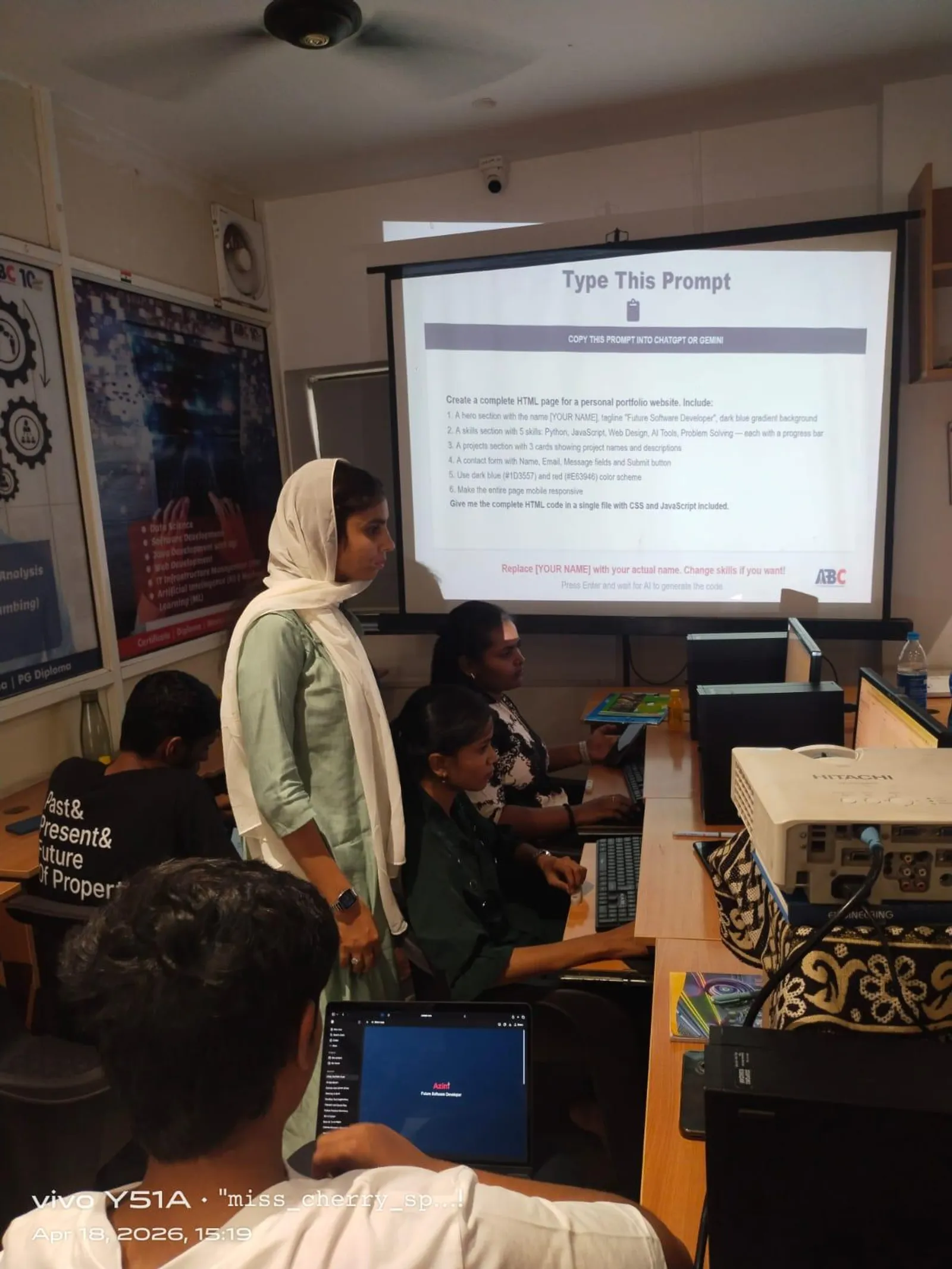
CSS3 foundations like margin, box-shadow, display, and flexbox are what separate a front-end developer who can build from scratch from one who can only customise templates. Indian companies including TCS (12,000 workforce adjustments in July 2025 signal continued premium on skilled developers), Infosys, KPIT Technologies, and Pune SaaS startups consistently test CSS fundamentals in front-end and full stack interviews. Full stack web developers in India earn Rs 5-8 LPA at one to two years and Rs 9-16 LPA at three to five years, with senior engineers at product companies reaching Rs 20+ LPA (Glassdoor India and AmbitionBox, April 2026). ABC Trainings' AI Powered Application Development course covers the complete CSS3 to full stack path — HTML5, CSS3, JavaScript, React, Node.js, Express, MongoDB — with real projects that go into interview portfolios. Batches run across five centres including Wagholi and Hadapsar in Pune and Osmanpura and Cidco in Sambhajinagar. CMYKPY stipend of Rs 6,000-10,000 per month is available for eligible Maharashtra students. WhatsApp 7774002496 for the next batch schedule.
Get the AI Powered Application Development Brochure + Fees + Batch Dates on WhatsApp
Free 1:1 counselling. Placement track record. CMYKPY/PMKVY eligibility check.
💬 Get Brochure on WhatsApp📞 Call 7039169629About the author: Rahul Patil. 12 yrs experience training engineers across Maharashtra.
Visit Our Centers
- Wagholi (Pune): 1st Floor, Laxmi Datta Arcade, Pune-Ahilyanagar Highway. Call 7039169629
- Hadapsar (Pune HQ): 1st Floor, Shree Tower, opp. Vaibhav Theater, Magarpatta. Call 7039169629
- Cidco (Chh. Sambhajinagar): Kalpana Plaza, opp. Eiffel Tower, N-1 Cidco. Call 7039169629
- Osmanpura (Chh. Sambhajinagar): S.S.C Board to Peer Bazar Road, near Jama Masjid. Call 7039169629
- Sangli: Shubham Emphoria, 1st Floor, Above US Polo Assn., Sangli-Miraj Rd, Vishrambag. Weekend batches available. Call 7039169629
FAQs
Why does margin:0 auto not centre my element in CSS?
margin:0 auto only centres block-level elements that have a defined width. If your element has no width set, it stretches to fill the parent and there is no remaining space to distribute. If your element has display:inline or display:inline-block, auto margin on the sides has no effect. Ensure the element is display:block (or display:flex/grid on the parent) and has an explicit width or max-width before applying margin:0 auto.
What is collapsing margin in CSS3 and how do I fix it?
Collapsing margin happens when two adjacent block elements both have vertical (top or bottom) margins. Instead of adding together, the margins collapse into the larger single value. For example, a paragraph with margin-bottom:24px above a heading with margin-top:16px creates 24px of gap, not 40px. To prevent collapsing, use padding instead of margin, or add any border, padding, or overflow property to the parent container. Margin collapsing only occurs on vertical margins between block elements — horizontal margins never collapse.
How do I create a soft shadow on a card component using CSS3 box-shadow?
A standard card soft shadow uses: box-shadow: 0 4px 16px rgba(0, 0, 0, 0.10). The horizontal offset is 0 (shadow below, not to the side), vertical offset is 4px (shadow below the card), blur is 16px (soft edge), no spread value (default zero), and the colour is black at 10% opacity for a natural tint. Add box-shadow: 0 8px 32px rgba(0, 0, 0, 0.15) on :hover with a transition: box-shadow 0.2s ease to create a lift effect when the user hovers over the card.
What is the difference between box-shadow and text-shadow in CSS3?
box-shadow applies a shadow around the element's box (its border edge). It supports offset-x, offset-y, blur, spread, and colour values, and can be placed outside (default) or inside (inset) the element. text-shadow applies a shadow directly to the text characters inside an element. It supports offset-x, offset-y, blur, and colour but no spread value. Use box-shadow for card elevation and UI depth effects. Use text-shadow for improving text readability over backgrounds or for creative typography treatments.